Case Study · 2015 — 2016
Korean Retail · Mobile App UX
Mega Mart
Redesigning the information architecture of a national retail app to improve feature discoverability and everyday usability.
Loyalty, coupons, receipts, events, store information — all the everyday retail tools shoppers reach for, reorganized around what people actually come to do.
This week only
Fresh deals up to 40% off
Shop nowCategories
Rewards
Point Card
1234 5678 9012
Coupons
12
Mega Point
3,480
This week only
Fresh deals up to 40% off
Role
- UX / UI Designer
- Early career
Timeline
- Nov 2015 — Mar 2016
Platform
- Android
- iOS
Team
- Internal Product Team
Client
- Mega Mart
- Retail
Tools
- Adobe Photoshop
- Adobe Illustrator
01 — Overview
Restructuring information architecture to improve discoverability and everyday usability.
Mega Mart is one of Korea's largest retail chains — shopping, loyalty rewards, coupons, promotions, and store information delivered through its mobile app.
The existing app had grown around individual features rather than customer tasks, resulting in fragmented navigation, inconsistent visual hierarchy, and poor discoverability of frequently used functions.
This redesign focused on restructuring the information architecture, simplifying navigation, and improving usability for everyday shoppers while creating a more consistent retail experience.
Loyalty
Store
Discover
02 — Challenge
Navigation complexity hiding the features shoppers used most.
The primary challenge was not checkout conversion — it was navigation complexity.
Frequently used features such as Point Card, Coupons, Store Information, Events, and Mobile Receipt were difficult to find. Navigation had grown organically without a clear hierarchy, burying important features below the fold.
Visual hierarchy was inconsistent across screens. Users had to remember where features lived instead of naturally discovering them, increasing cognitive load and reducing everyday usability.
Navigation grew feature by feature
Red = a feature shoppers used often, four or five taps deep.
Buried below the fold
- Point Cardhard to find
- Couponshard to find
- Mobile Receipthard to find
- Eventshard to find
- Store Infohard to find
Users had to remember where features lived instead of discovering them.
03 — Goals
Simpler navigation. Stronger hierarchy. Better discoverability.
The redesign focused on organizing complexity and improving the everyday shopping experience.
Improve information architecture by restructuring the app around customer tasks rather than internal features. Simplify navigation to reduce the number of steps required to reach common functions.
Improve feature discoverability so frequently used services are visible at a glance. Reduce cognitive load through clearer grouping and consistent visual hierarchy. Strengthen visual hierarchy and improve overall usability across the entire experience.
Information architecture
Restructure the app around customer tasks, not internal features.
Navigation
Fewer steps to reach the functions people use every visit.
Feature discoverability
Frequently used services visible at a glance.
Cognitive load
Clearer grouping and consistent hierarchy.
Visual hierarchy
A predictable typographic and spacing scale.
Everyday usability
Less memorization, faster routine tasks.
04 — UX Evaluation
Evaluating the existing experience through structured review.
The team ran a structured evaluation of the existing app to identify the highest-impact improvements.
Existing UX review mapped every screen against customer tasks to identify friction points and dead ends. Navigation audit traced the path to each major feature and measured the number of taps required.
Information architecture review assessed how services were grouped and categorized. Competitive retail-app review compared navigation models against leading Korean and international retail apps. Visual hierarchy assessment evaluated consistency in typography, spacing, color usage, and iconography across screens.
The audit path
- Current app
- Navigation audit
- IA review
- Hierarchy assessment
A structured pass, not a redesign sketch — every screen measured against the task a shopper actually opened the app to do.
What each pass looked for
Existing UX review
Screens mapped to customer tasks — friction points and dead ends
Navigation audit
Taps to reach each major feature
IA review
How services were grouped and categorized
Competitive review
Navigation models vs. leading Korean & global retail apps
Visual hierarchy assessment
Type, spacing, color, and icon consistency across screens
05 — Design Process
From review to final design through structured redesign.
The process followed a clear sequence of evaluation, restructuring, and visual refinement.
Current UX Review → Information Architecture Review → Navigation Redesign → Wireframes → Visual Design → Final Design Review.
Each phase built on the previous: the UX review identified navigation complexity as the core issue; the IA review informed a new structure; wireframes tested the new hierarchy; visual design unified the experience; and the final review ensured consistency before handoff.
- 1Current UX Review
- 2IA Review
- 3Navigation Redesign
- 4Wireframes
- 5Visual Design
- 6Final Design Review
06 — Information Architecture
Reorganizing the app around user intent, not feature lists.
The app structure was reorganized around customer tasks rather than internal feature organization.
The new architecture introduced a simplified navigation hierarchy that grouped related services: loyalty and rewards in one area, store and shopping tools in another, so they appeared naturally during shopping journeys. Important features were moved closer to the surface, reducing the number of taps required to reach common tasks.
Navigation depth was reduced by flattening the hierarchy where possible. Frequently used features like Point Card, Coupons, and Mobile Receipt were promoted to top-level access. The category structure was clarified so shoppers could browse by intent rather than memorizing where each function lived.
Reorganized around intent · one predictable structure
- Categories
- Search
- Fresh
- Point Card
- Coupons
- Mega Point
- Store Locator
- Mobile Receipt
- Hours
- Events
- Fresh Story
- Brand Info
- Orders
- Membership
- Settings
07 — Navigation Optimization
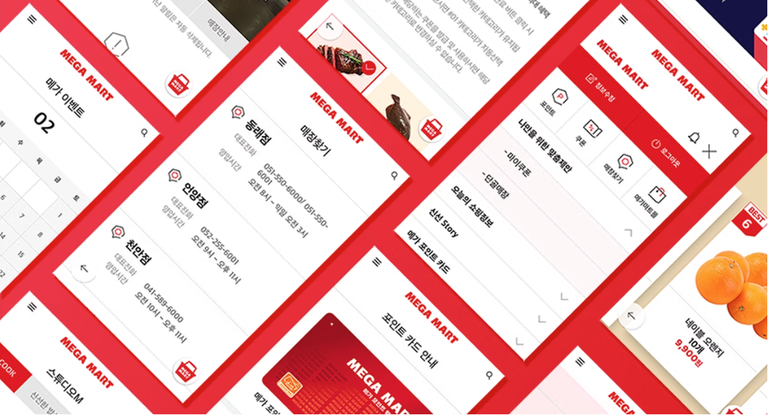
A cleaner menu structure that surfaces what matters.
Navigation was redesigned to reduce complexity and make common tasks immediately accessible.
The menu structure was simplified from a fragmented list into a clearer, grouped organization. Navigation labels were rewritten to reflect customer language rather than internal terminology, making it easier for shoppers to predict where each feature lives.
Related features were grouped logically: rewards, coupons, and receipts together; store locator, events, and brand information in another area. Visual clutter was reduced through cleaner layouts and stronger hierarchy. Common tasks became faster to reach, often in one or two taps from the home screen.
08 — Core Features
Major services reorganized for better discoverability.
The redesign restructured how major features were presented to improve findability and everyday use.
Point Card, Coupons, and Mega Point — the loyalty ecosystem — were grouped and surfaced more prominently. Mobile Receipt and Store Locator were repositioned to appear at the moments shoppers naturally needed them. Events and Fresh Story were restructured so promotional content was visible without overwhelming the main navigation.
Brand Information was reorganized to support discovery without adding complexity. Each feature was evaluated not just for its individual design, but for its place in the overall navigation and how easily shoppers could move between related services.
Loyalty
Store
Discover
09 — Visual Improvements
A cleaner, more consistent visual language.
The visual design was refined to support clarity and reduce cognitive load across the experience.
Visual hierarchy was strengthened through a clearer typographic scale, bolder section headings, and more consistent use of spacing. Layouts were cleaned up to reduce clutter and guide attention to the most important actions on each screen.
Color usage was simplified to create a calmer, more cohesive experience. Typography was standardized for readability. Iconography was made consistent. Improved spacing and alignment reduced visual fatigue and made scanning faster across all major screens.
What changed
- Stronger hierarchy
- Simplified color usage
- Improved spacing
- Clearer typography
- Unified iconography
10 — Design Foundations
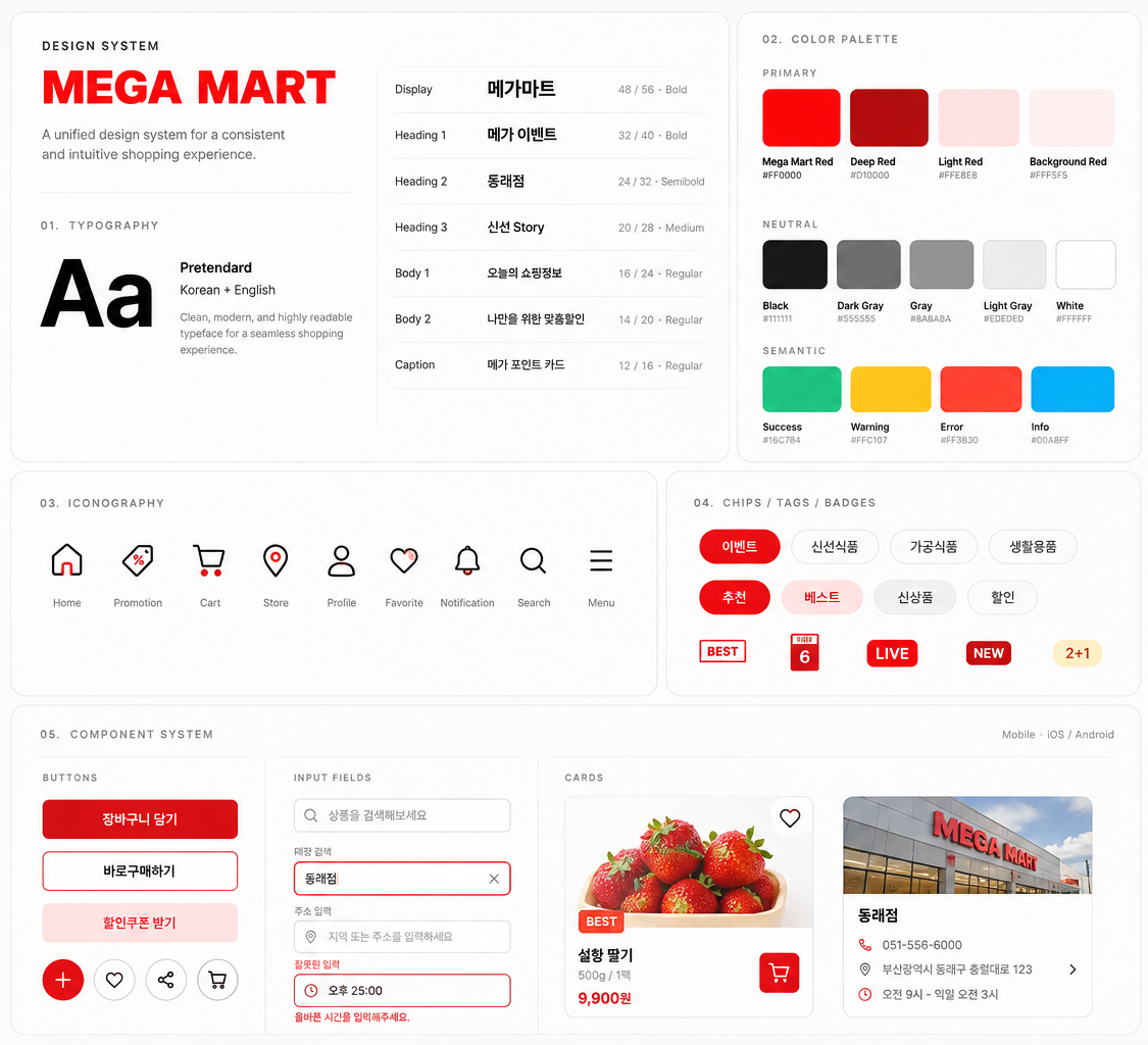
Establishing consistency through unified design standards.
The redesign introduced clearer design foundations to create a more cohesive product experience.
Color consistency was established across screens so shoppers met a familiar palette whether viewing coupons, store information, or loyalty details. Typography was standardized with a clear hierarchy that supported scanning and readability.
A consistent grid and layout structure aligned elements predictably. Iconography was unified to reduce visual noise. UI standards for buttons, lists, and cards created cohesion across the app, making the experience feel more intentional.
11 — UX Impact
A more organized, intuitive, and cohesive retail experience.
The redesign delivered clear improvements to the structure and usability of the Mega Mart app.
Information architecture was improved by restructuring the app around customer tasks. Navigation was simplified, making it faster to reach frequently used features. Feature discoverability improved because important services were surfaced rather than buried.
Visual complexity was reduced through cleaner layouts and stronger hierarchy. Visual consistency strengthened across screens through unified color, typography, and spacing. Everyday usability improved because shoppers could find what they needed with less effort and less memorization.
Improved information architecture
Restructured around customer tasks rather than internal feature lists.
Simplified navigation
Common functions reachable in one or two taps from home.
Better feature discoverability
Loyalty, receipts, and store tools surfaced instead of buried.
Reduced visual complexity
Cleaner layouts and calmer, more deliberate color use.
Stronger visual consistency
Unified type, spacing, and iconography across screens.
Better everyday usability
Less memorization for the tasks shoppers repeat every visit.
12 — Reflection
Information architecture is the invisible structure that shapes every interaction.
This early-career project shaped how I think about organizing complexity into clarity.
It taught me that improving a product is often less about adding features and more about organizing complexity into clear, intuitive experiences.
The principles I applied here — information hierarchy, navigation design, and user-centered thinking — still influence my approach today. Whether the product is a retail app, a fintech platform, or an AI-native tool, structuring information around user intent remains central to how I design.
Avigail Kim · UX / UI Designer