


UX/UI | Android, IOS | NOV 2015 - MAR 2016
Mega Mart
A Schematic redesign for Nongshim Megamart App
It was suggested that the mega-mart application gave an incomplete feeling in the UX segment,
which was redesigned to make it easier for the Megamart customer base to use.
Timeline : November 2015 - March 2016
Platform : Android, IOS
My Role : Design Lead
Tools : Photoshop, Illustrator
Problems with Old App Design
- It is inconvenient because the entire menu is hidden below.
- Megamart's red tone and manners don't match with buttons of various colors.
- The layout of the text in the button is not organized.
Construction

Mega Mart App
main screen bar
It removed the background screen color of the previous main screen bar and gave an open space to remove the previously frustrating feeling.
Similarly, menu buttons and search buttons were grayed out to make them simple and easy to recognize by eliminating color and button lines.

Menu Button
A light gray color separates the button from the background.
By eliminating the margins between buttons, users have expanded the scope of pressing the buttons.
Reinforce key functions and organize tone and
manners to meet the needs and objectives of users
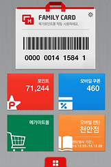
Point card
With an online-only point card, you can use it conveniently and easily at the store without an offline card.
My Coupon
Mega PICK! Enjoy various benefits including customized coupons, partnerships and app installation coupons for each category.
A regular store
Set up your own regular store to check out various information such as push notifications and store events.
Today's Recommended BEST
Get the real, affordable BEST Flyer Discount recommended by Mega mart every day.
Mega Event
A variety of fun events across card partnerships, attendance checks, comments, campaigns and more.
Fresh Story
A fresh story of Mega Mart's self-reliant brand Shin Do-won, who manages the entire process very strictly in hopes of your longevity.
Point/Mobile Receipt
You can check the remaining points and mobile receipts.
