Beauty Angel
A beauty identity for Amorepacific’s luxury-brand app — redesigned so it reads as beauty at a glance.
- Client
- Amorepacific
- Timeline
- May 2017
- My Role
- Logo Design
- Tools
- Photoshop, Illustrator
Brand Identity
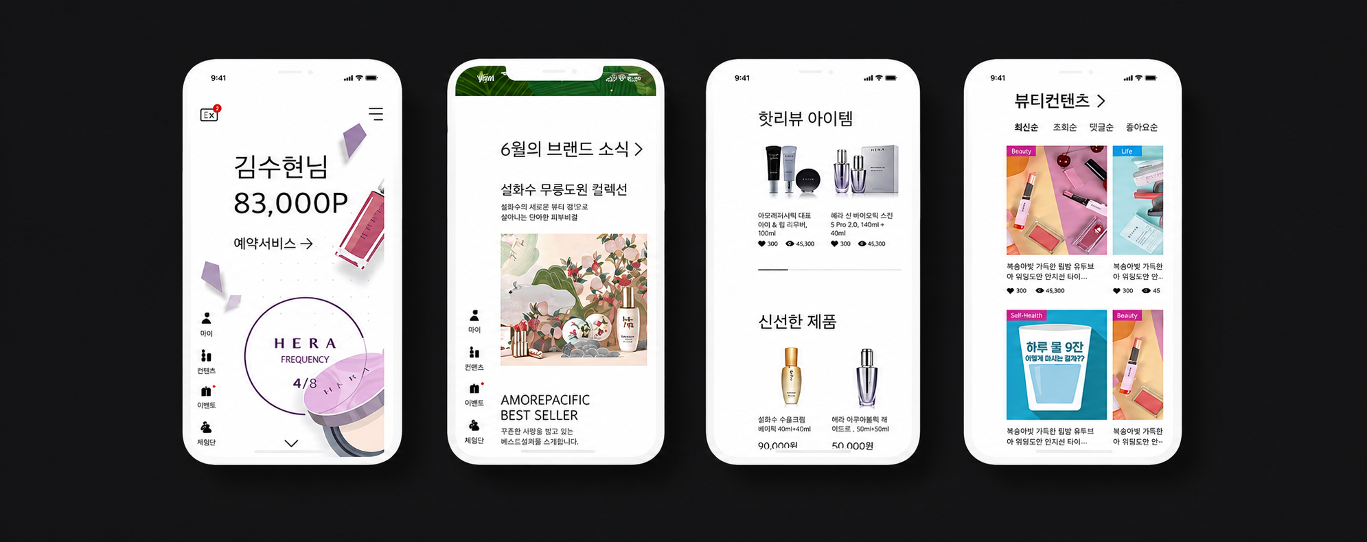
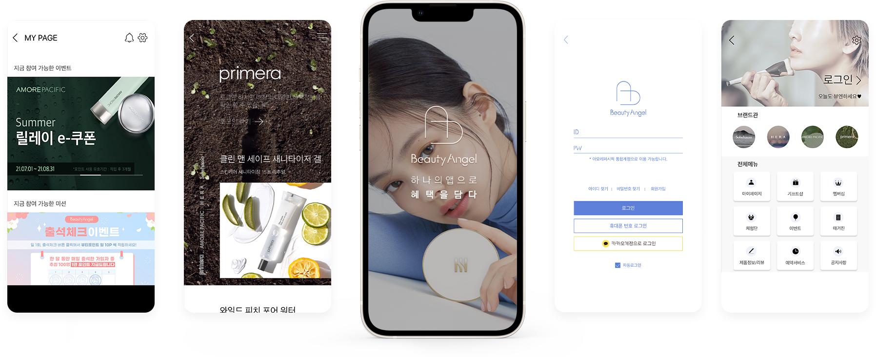
Beauty Angel is the app where Amorepacific’s customers experience its luxury brands — Sulwhasoo, Hera, Amorepacific, and Primera — in one place.
Its original logo was a blue line mark representing the Amorepacific company. Feedback was clear: it wasn’t recognised as a beauty app. I redesigned the identity and explored two directions.

Brand Foundation
Beauty
The previous logo was a blue line taken from the corporate identity. It didn’t read as cosmetics — the brief was to make the app look like beauty at a glance.
Trust
Continuity over shock: both directions keep a link to Amorepacific — its blue family and its corporate serif — so existing customers stay oriented.
Approachable expertise
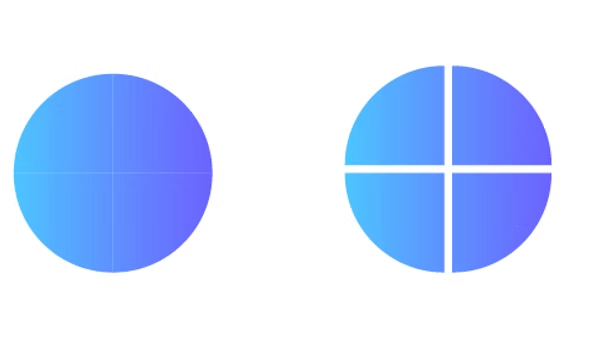
One app gathers four luxury brands. The symbol is built from four pieces of one circle — expertise, made friendly and round.
Feminine but modern
A serif with a feminine touch instead of a rigid sans; soft gradients instead of a flat primary blue.
Premium yet accessible
Pastel tones, rounded forms, and generous space — luxury cues without distance.
Exuberant · Young · Interactive
Feminine · Soft · Moderation
Color System
Two gradients, one idea: just as two colors blend into a new one, Beauty Angel brings four luxury brands together into a new brand image.
The ba monogram
Stays in the blue family of the existing logo so customers recognise the change — shifted to pastel tones that suit a beauty app.
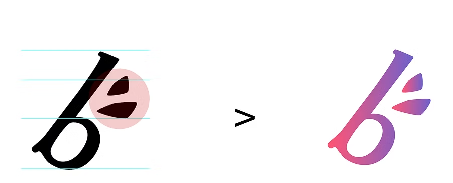
The winged b
Combines Amorepacific’s blue with pink into one gradient that brings out a beauty image.
Typography
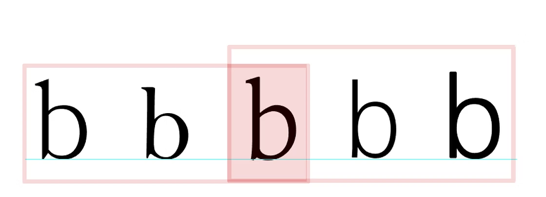
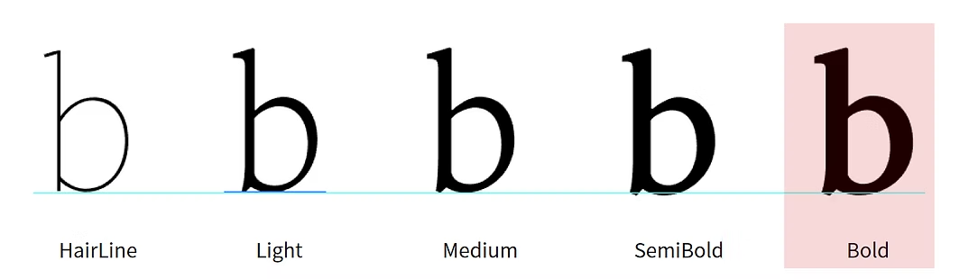
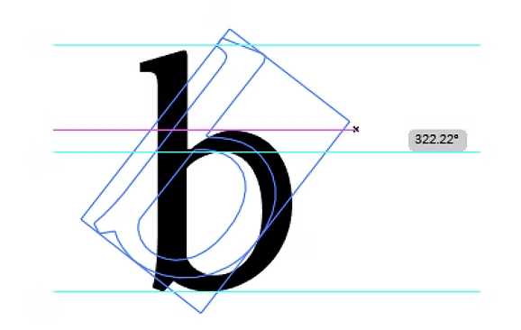
The winged b starts from Arita Buri — Amorepacific’s own corporate serif — so the new mark is rooted in the company’s typography.
- 01A serif with a more feminine touch than the rigid image of a sans serif.
- 02Bold — the thickest, most powerful weight of the family — so the mark holds at icon size.
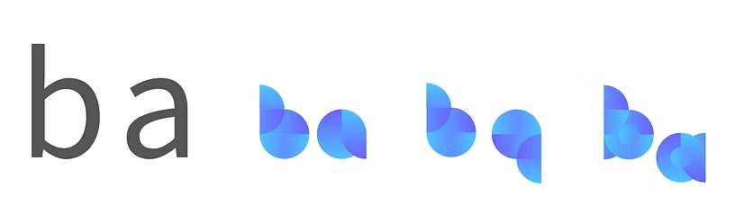
- 03The ba monogram uses round, geometric lowercase letters built from the same circle as the symbol.
Visual Language
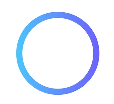
A circle has no beginning and no end — the continuous pursuit of beauty. Split into four pieces, it becomes a symbol for four luxury brands in one app, then the lowercase b and a.



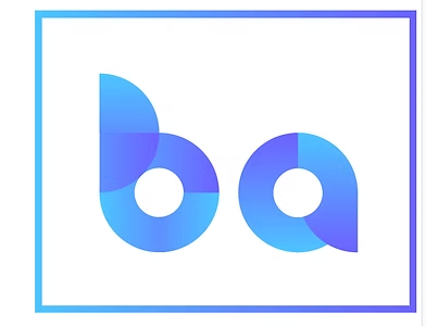
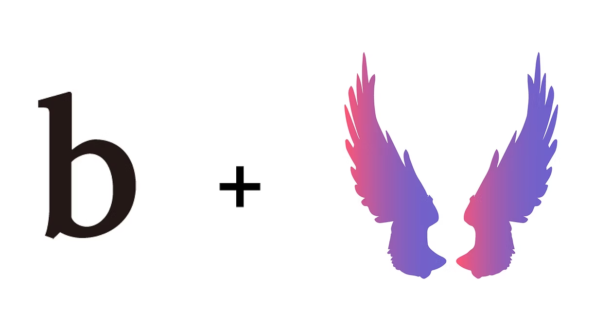
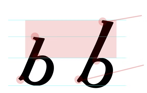
Beauty angel’s b plus the angel’s symbol — wings. The serif b is rotated into a diagonal wing, softened, and given simple feathers.
Brand Applications
Each direction was carried through to a full lockup and a set of app icons — symbol and wordmark, on white and on the brand gradient.
Key Brand Takeaway
A beauty app has to look like beauty at icon size — before a single screen is opened.
Both directions kept continuity with Amorepacific — its blue family and its corporate serif — while adding softness, gradient, and a symbol for four brands in one app.
Identity work for a product is judged on the home screen: legible, recognisable, and unmistakably in its category.