Cakely
AI Celebration Platform — an identity that makes chipping in together feel like celebrating together.
- Platform
- Web · getcakely.com
- Timeline
- 2026
- My Role
- Founder & Designer
- Typefaces
- Bagel · Instrument Serif · Inter
Brand Identity
Cakely’s identity is warm and editorial — closer to a card from a friend than a payment receipt.
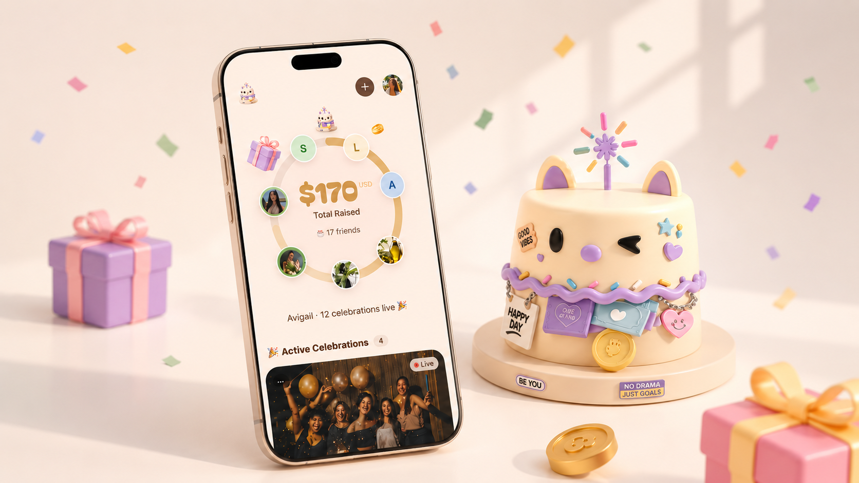
The visual direction pairs soft cream and pale lavender with a round, playful wordmark and one hero object — the cake — so the money moment always reads as a celebration.
Brand Foundation
Payments become celebrations.
Celebration-first
The product moves money, but the brand never leads with it. Every surface frames the moment as a celebration first.
Warm, sincere, playful
Soft cream, pale lavender, and a round, bouncy wordmark — playful enough to feel like a party, sincere enough to trust.
Emotional connection
The cake is the hero object: a shared symbol of the person being celebrated and everyone who chipped in.
Human and approachable
Sounds like a friend organising something thoughtful — never a bank, never a checkout.
Color
A palette built from the table at a celebration — icing, candle light, and chocolate — with pale lavender as the note of joy.
Warm cream / ivory
#FCEDE3
Calm · Spacious
Soft pale lavender
#C6BFEC
Gentle · Celebratory
Muted warm brown
#523931
Human · Grounded
Warm gold / cake tone
#E6CF9C
Light · Joy
Typography
Bagel Fat One
Playful type for the Cakely wordmark.
Cakely
Instrument Serif
Refined display serif for expressive headlines.
Maya’s 30th — a little something from all of us.
Inter
Clean sans-serif for product clarity.
$170 total raised · 17 friends
How Cakely’s type system comes together across the product experience.
Visual System
A small, consistent kit: the wordmark, the cake mascot, rounded icons, and a set of celebration motifs that recur across product and marketing.
- 01The cake mascot carries the brand when there is no room for the wordmark.
- 02Confetti, gift boxes, ribbons, and gold coins make the money moment feel festive.
- 03Icons are rounded, tactile, subtle, and quietly emotional.
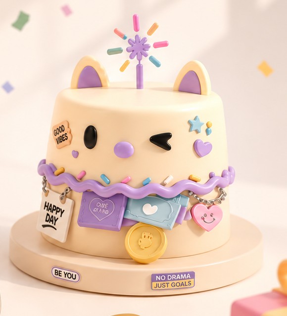
Rounded, tactile, subtle, and quietly emotional.
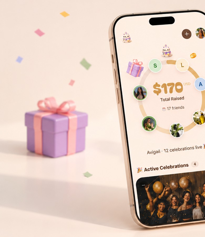
Brand Applications
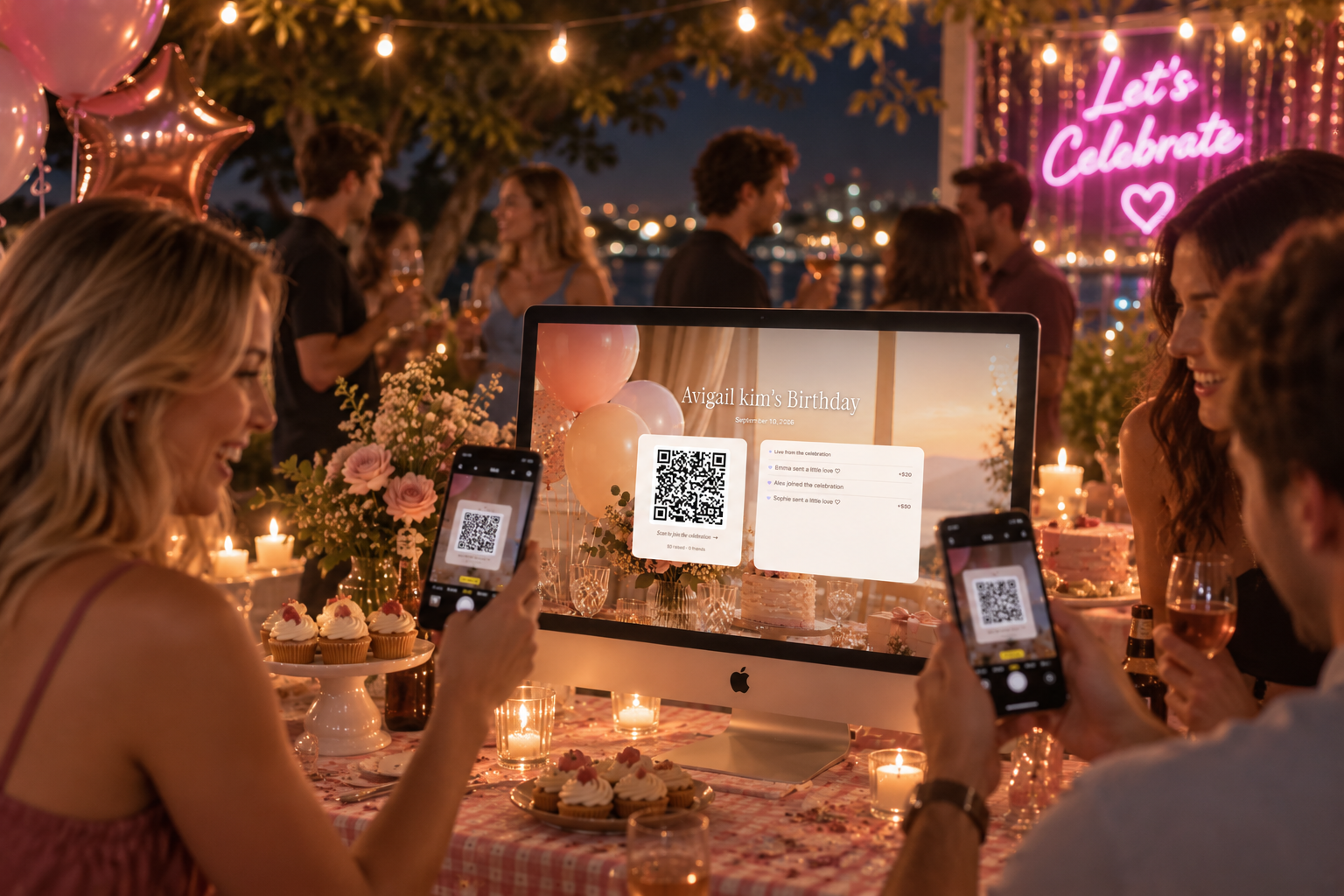
The identity had to hold up on a shared event page, a phone in someone’s hand, and the marketing site — warm without tipping into novelty.
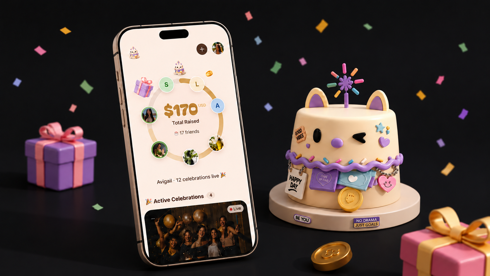
The same cream, lavender, and serif voice carry the public site — so a first visit already feels like an invitation.
Key Brand Takeaway
Cakely makes the money part of a gift feel like the celebration itself — warm, sincere, and a little playful.
Every brand decision had to survive on a shared invite, a phone checkout, and a card handed across a table.
The result sounds like a friend organising something thoughtful — never a bank, never a checkout.