TownCup
The app for a sports matchmaking experience for amateur athletes.
- Platform
- Android, iOS
- Timeline
- Apr 2020 — Mar 2025
- My Role
- Design Lead
- Tools
- Illustrator
Brand Overview
Towncup is a mobile sports platform designed for amateur athletes to connect, compete, and participate in matches with ease.
The brand was created to feel energetic, accessible, and trustworthy, reflecting the excitement of sports while remaining clear and functional across digital touchpoints.

Brand Goals
Create a bold and recognizable identity
in a competitive sports app market
Balance energy and clarity
for everyday amateur athletes
Ensure strong visibility
across app icons, UI, and marketing assets
Logo Design
The Towncup logo is designed to be simple, bold, and highly legible, even at small sizes.
- 01The “TC” monogram acts as a compact symbol for app icons and small surfaces.
- 02The wordmark emphasizes confidence and approachability.
- 03Rounded edges soften the brand, making it friendly rather than aggressive.





Color Strategy
#FF7915
- H
- 25°
- R
- 255
- S
- 91%
- G
- 121
- B
- 100%
- B
- 21
Orange was selected as the primary brand color to represent:
- Energy
- Movement
- Competition
- Excitement
The color contrasts strongly against light and dark backgrounds, helping key actions and brand elements stand out in the UI.
Orange Tint
#FFE9D2
Cream
#FBF8F4
Surface
#F2F2F2
Line
#E0E0E0
Ink
#000000
App Icon Design

The app icon focuses on maximum recognizability.
- 01Simple “TC” monogram for instant brand recall.
- 02High contrast color for visibility on crowded home screens.
- 03Consistent visual language with the in-app UI.
Brand in Product
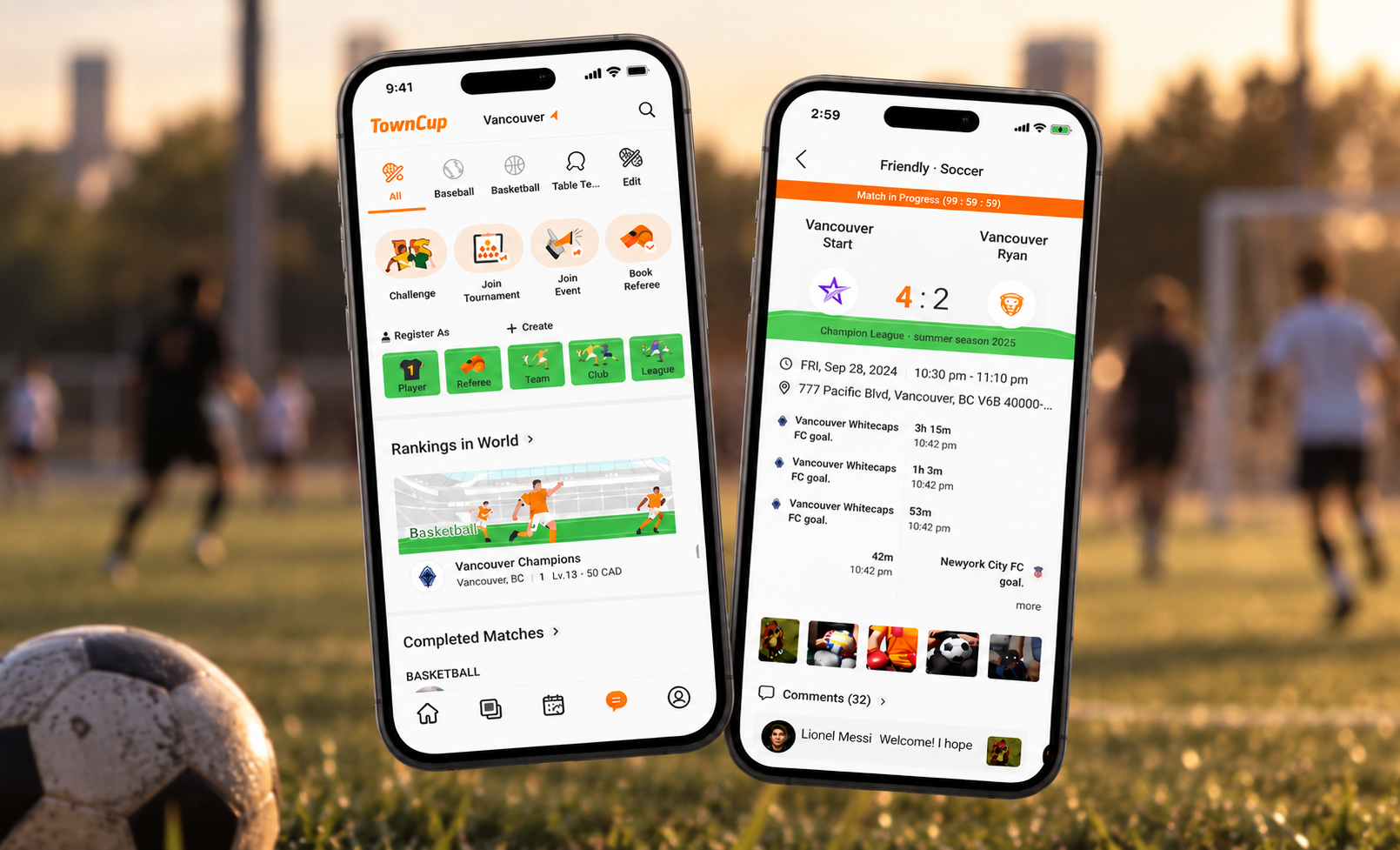
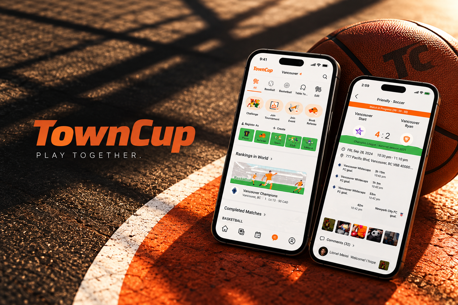
The brand system was designed to integrate seamlessly with the product UI.
- 01Logo and color system align with core UI components.
- 02Brand presence enhances usability rather than overpowering content.
- 03Visual consistency across onboarding, home screen, and in-match experiences.
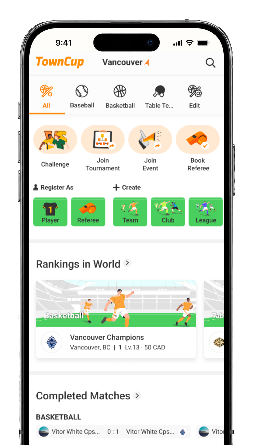 Home — find matches
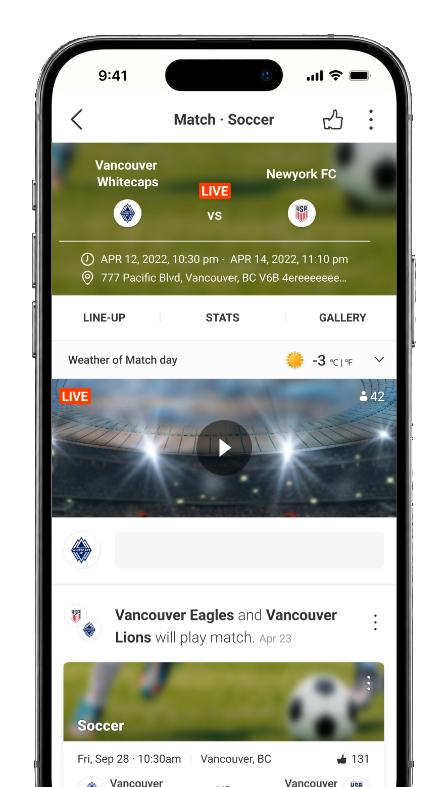 In-match
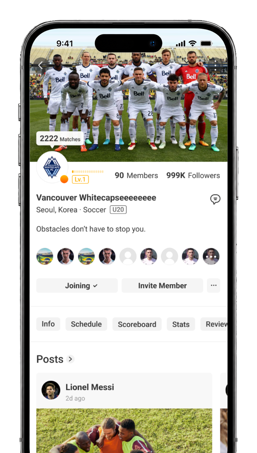 Community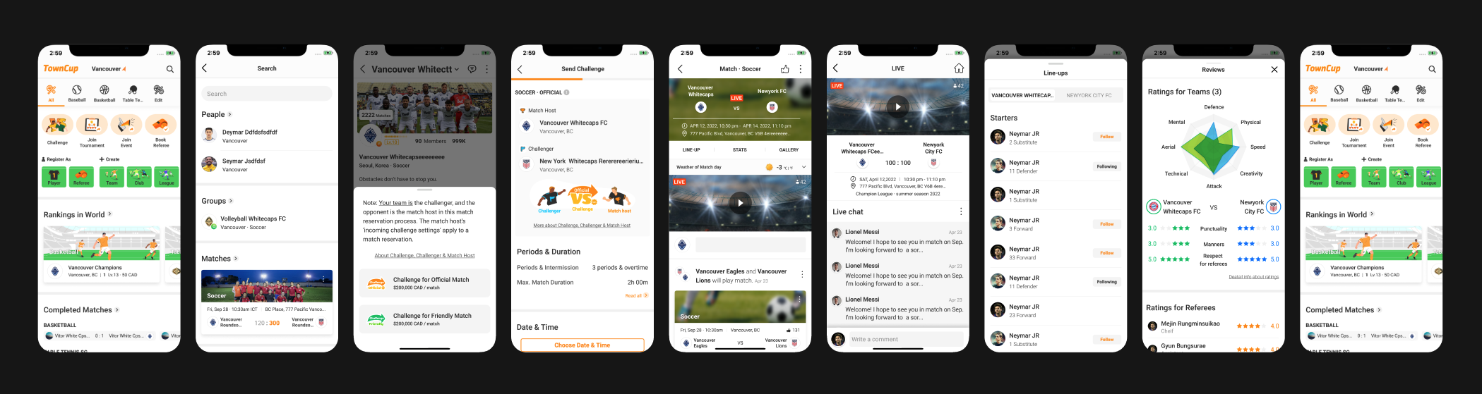
Treat branding as part of the product experience, not a separate visual layer.
Design intention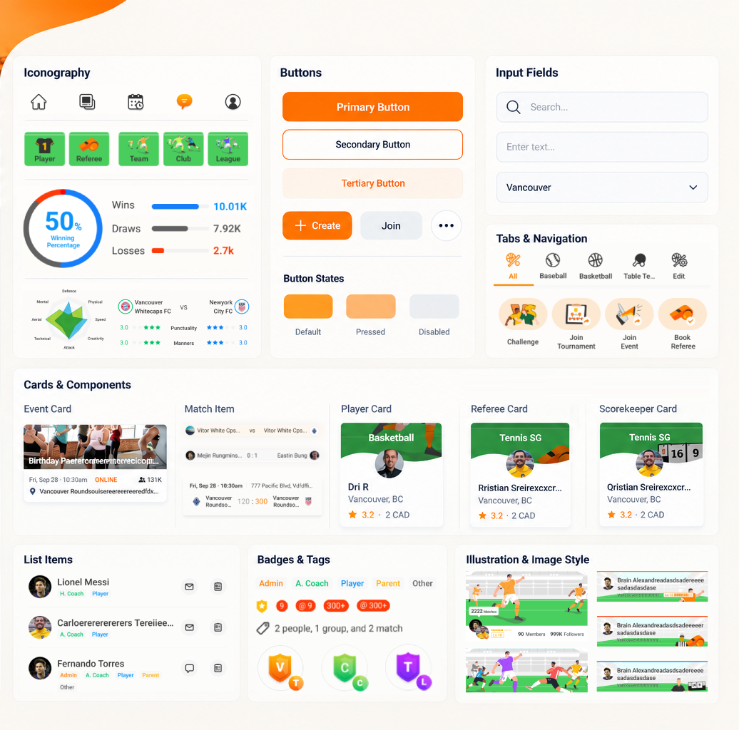 Component system — brand color carried into buttons, tabs, and badges
Key Brand Takeaway
The Towncup brand balances energy and clarity— creating a strong sports identity while remaining approachable and functional for everyday users.
Although this project focuses on app UI design, the product itself functions as the primary brand touchpoint.
Brand values such as energy, accessibility, and trust are intentionally expressed through layout, interaction, and visual language.
TownCup UI Design Rationale — Home
Designed to help amateur athletes quickly find, join, and manage matches with clarity and speed.
TownCup App — Case Study
End-to-end product UX and scalable design system for a mobile sports platform.
TownCup UI Design Rationale — Match Experience
End-to-end match experience designed for clarity and flow.
Townty Logo Concept Design
An alternative logo concept focused on community.