Reservation Service Visual Content
Visual content designed for AMOREPACIFIC’s reservation service, creating a premium and consistent experience for customers discovering beauty services, events, and brand experiences.
- Role
- Content Design
- Timeline
- 2016 — 2019
- Brand
- AMOREPACIFIC
- Tools
- Photoshop · Illustrator
The work focused on translating multiple luxury beauty brands into clear, engaging service content while maintaining a consistent visual language across the reservation experience.
AMOREPACIFIC’s reservation service connected customers with brand experiences, beauty consultations, events, and in-store services across its portfolio of beauty brands.
As a content designer, I created visual assets that helped customers quickly understand available services while expressing the distinct identity of each brand.
How do you create a consistent reservation experience across multiple beauty brands without losing what makes each brand distinct?
Each brand had its own visual language, audience, and tone. The challenge was to build content that was immediately understandable within a shared service experience while preserving the premium character of each brand.
One reservation experience
Multiple brand identities
Clarity
Make services, reservations, and event information immediately understandable.
Brand Expression
Translate each brand’s visual identity into content without compromising recognition.
Consistency
Create a cohesive reservation experience across multiple brands and service touchpoints.
- 01Multiple brands
- 02Shared reservation service
- 03Brand-specific visual language
- 04One cohesive customer experience
Sulwhasoo
Visual content designed around Sulwhasoo’s refined heritage and premium skincare experience.
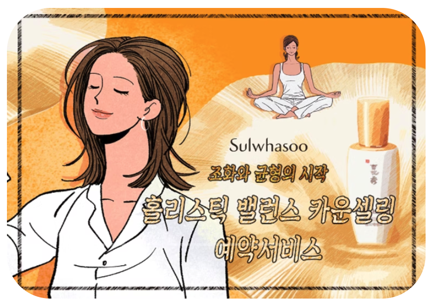 Service key visual
 Booking flow · in app
HERA
Content reflecting HERA’s contemporary, confident identity while helping customers discover and reserve beauty services.
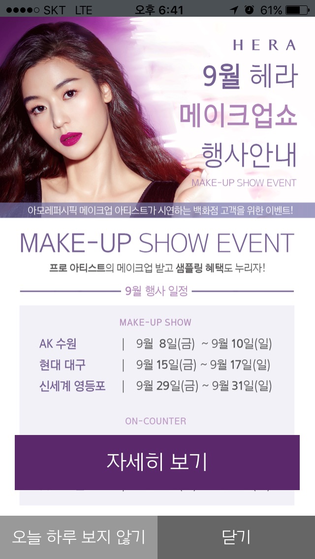 Make-up Show · Sep
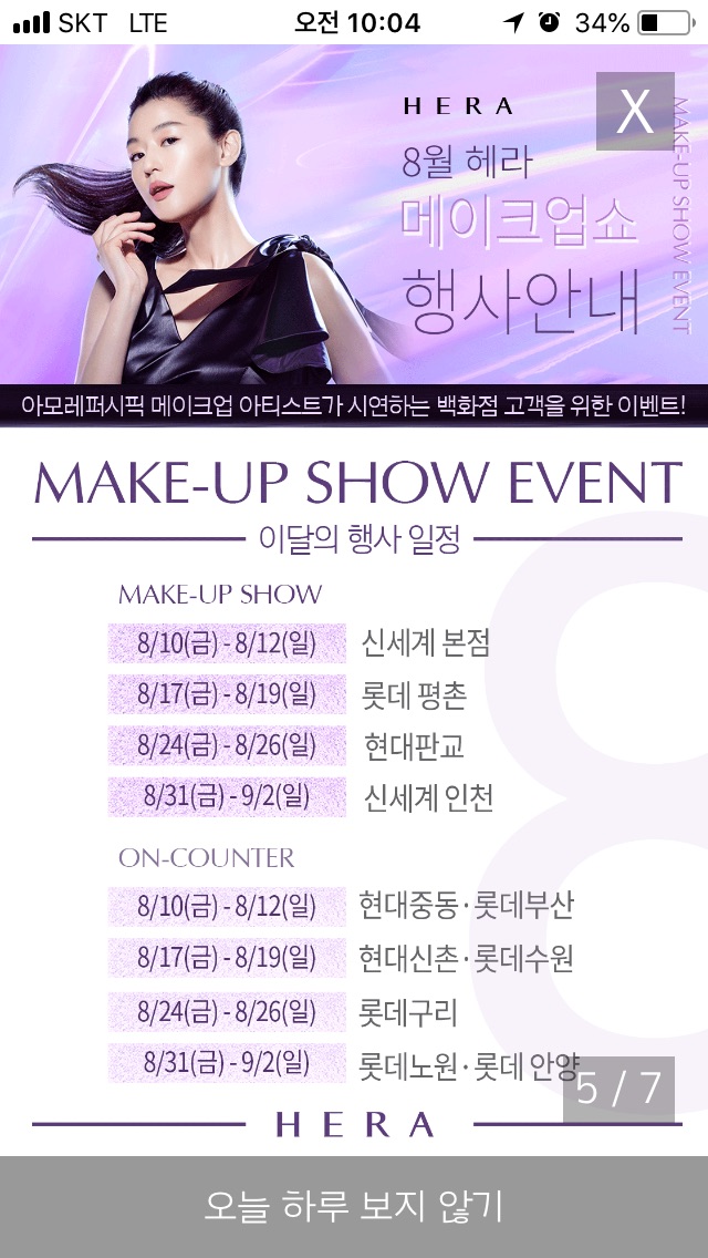 Make-up Show · Aug
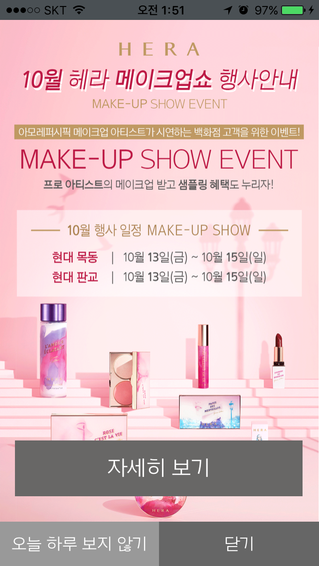 Make-up Show · Oct
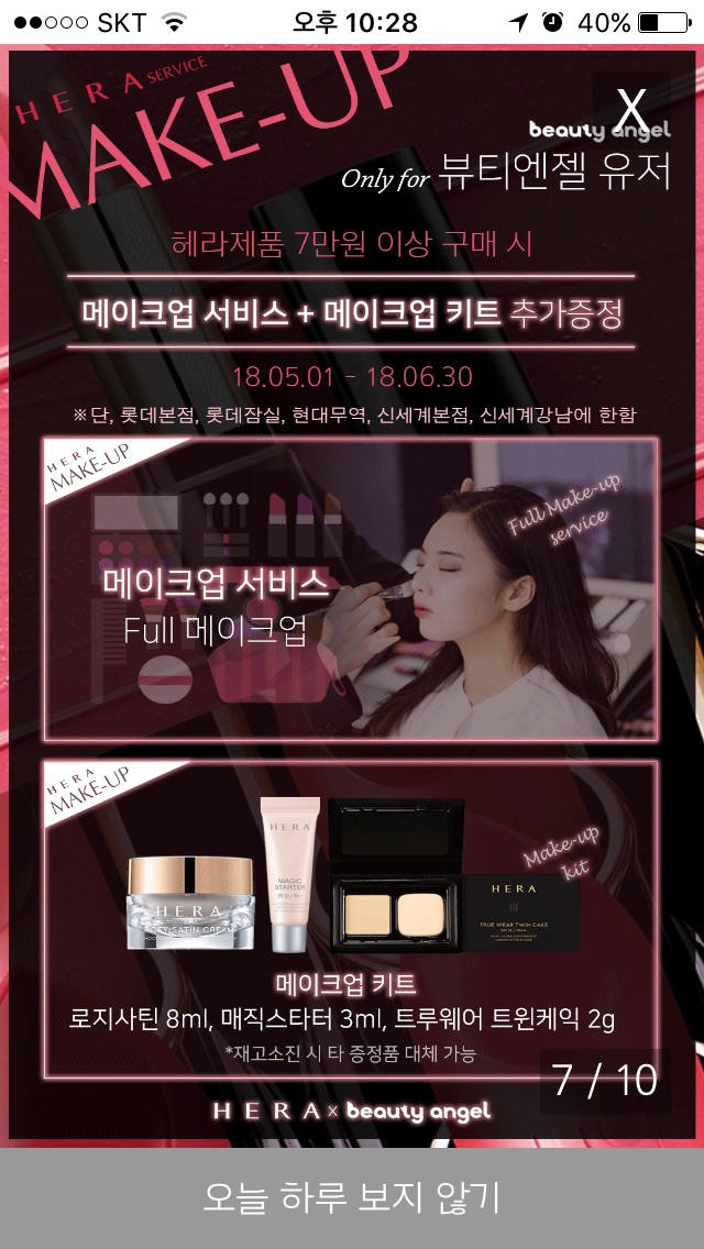 Makeup Service
Primera
Clean and approachable visual content aligned with Primera’s natural and eco-conscious brand character.
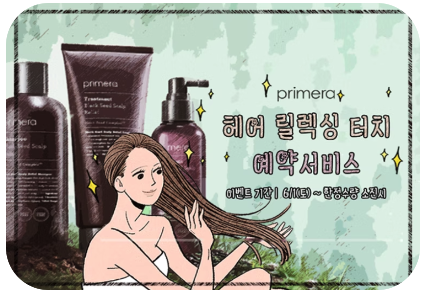 Service key visual
 Booking flow · in app
A shared visual language for service discovery
Across different brands and services, the content followed a consistent hierarchy so customers could quickly scan what was available, understand the experience, and decide whether to make a reservation.
- 01Brand
The brand leads — wordmark and imagery set the tone first.
- 02Service
What the experience is, named plainly.
- 03Date / Event
When and where, as a schedule that scans at a glance.
- 04Key information
Benefits and conditions in short, separated lines.
- 05Call to action
One clear next step.
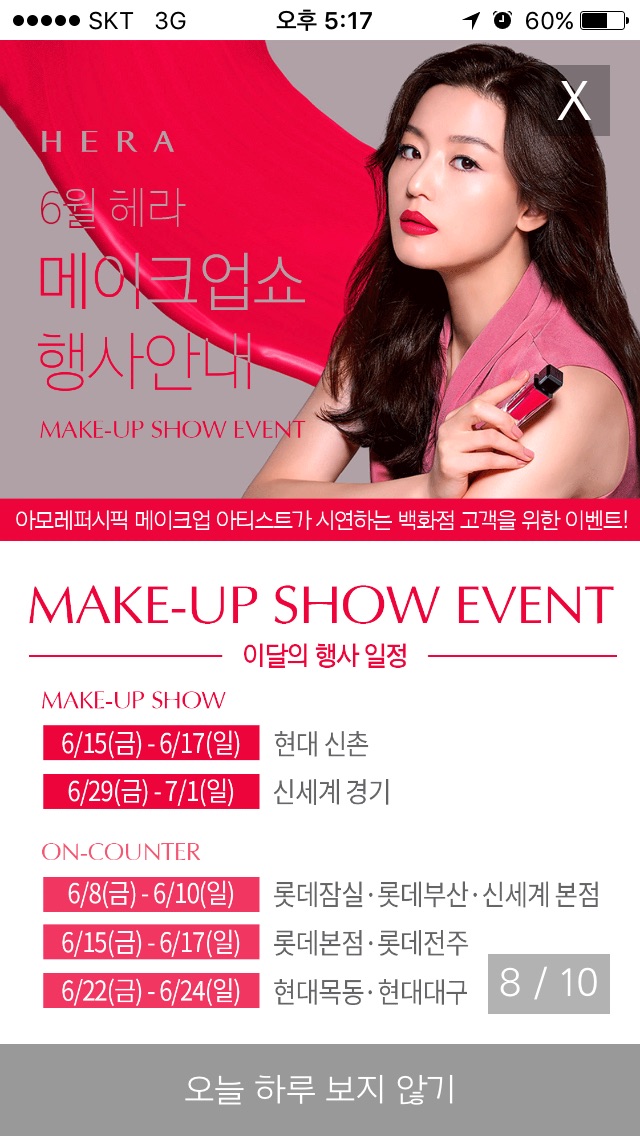 One screen, five levels — HERA Make-up Show
Content Design
I contributed to the visual design of reservation and service content across AMOREPACIFIC’s beauty brand ecosystem.
- 01Content Design
- 02Visual Direction
- 03Campaign Assets
- 04Brand Adaptation
- 05Digital Content
Across multiple brands and service experiences, the work balanced a shared reservation structure with distinct visual identities — helping customers discover and engage with AMOREPACIFIC’s beauty services through a consistent premium experience.